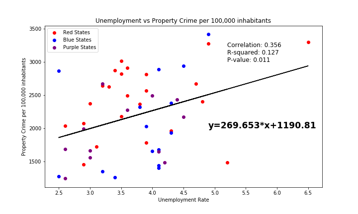
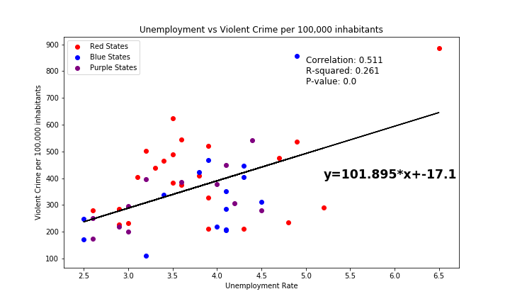
Violent Crime by Political Party
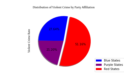
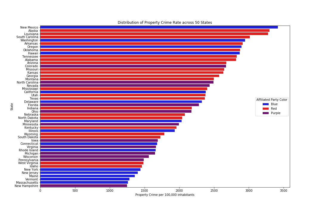
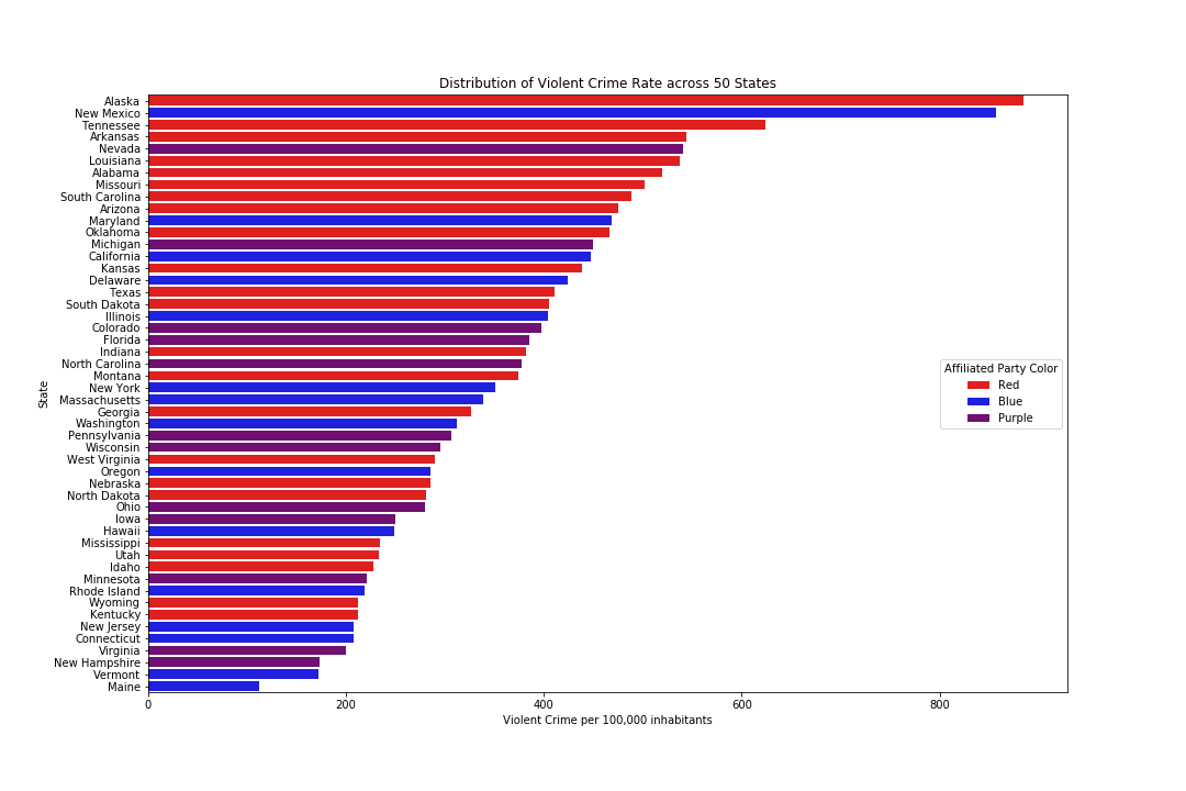
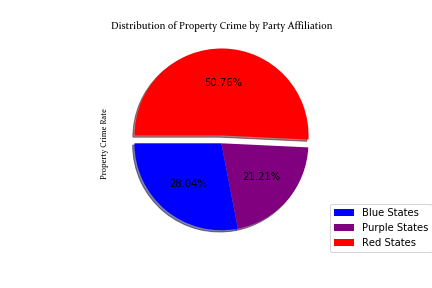
This pie chart puts the information we viewed in the respective bar chart into perpective by providing a ratio representation between political parties in the US. We can clearly note that Red states comprise just over half of Violent Crime Rates in the Unites States. What type of programs are Blue and Purple states promoting or what laws are they enforcing that are potentially making the difference? Click on Property Crime Rates to see how each state and party performs.
